Leaves of Change/Event Unleashed
Transform Business Concept to An Impactful Product
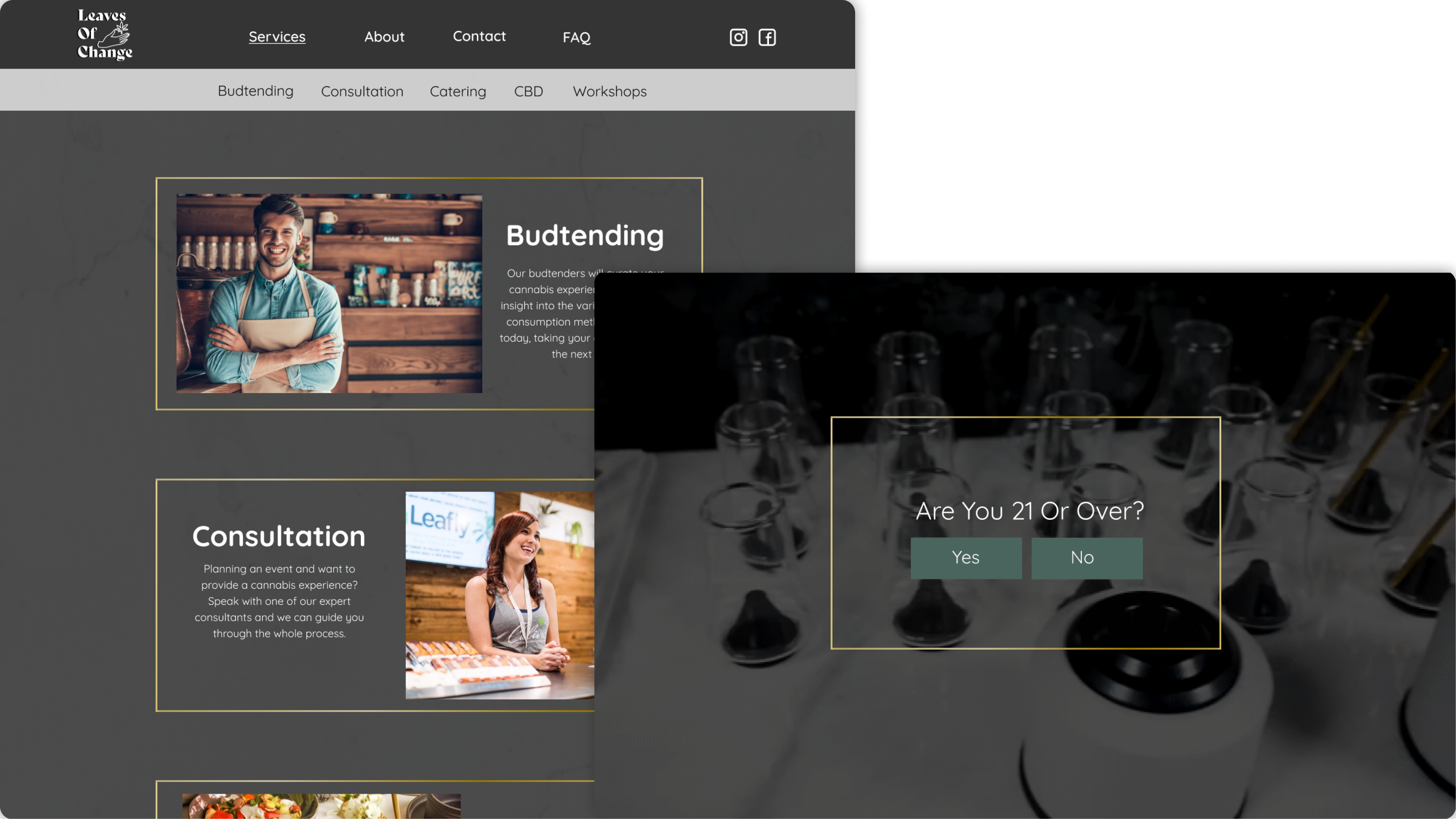
We created a brand identity “Leaves of Change” for our client’s luxury cannabis business. We designed a web application, a product that will both provide business service and emphasize her vision of addressing social issues
🎯Target users: weddings and events planners
OVERVIEW
Problem & Solution
• Create a product based on a mere concept:
We decided to design a web application instead of a mobile app to increase exposure. Because this is an early change, a web application would be more accessible and flexible to house potential business growth and changes.
• Unidentified MVP:
We defined the MVP to be the following: 1) premium cannabis product and service, 2) cannabis workshop for educational purposes, and 3) cannabis-related social discrimination community. They met both business and branding needs.
• Liability concern: We implemented a state-specific feature on the Q&A page. Because the result of user research showed that the users were unsure about the cannabis regulations.
OVERVIEW
Solution
•
Used Figma's component library to create an efficient design experience.
•
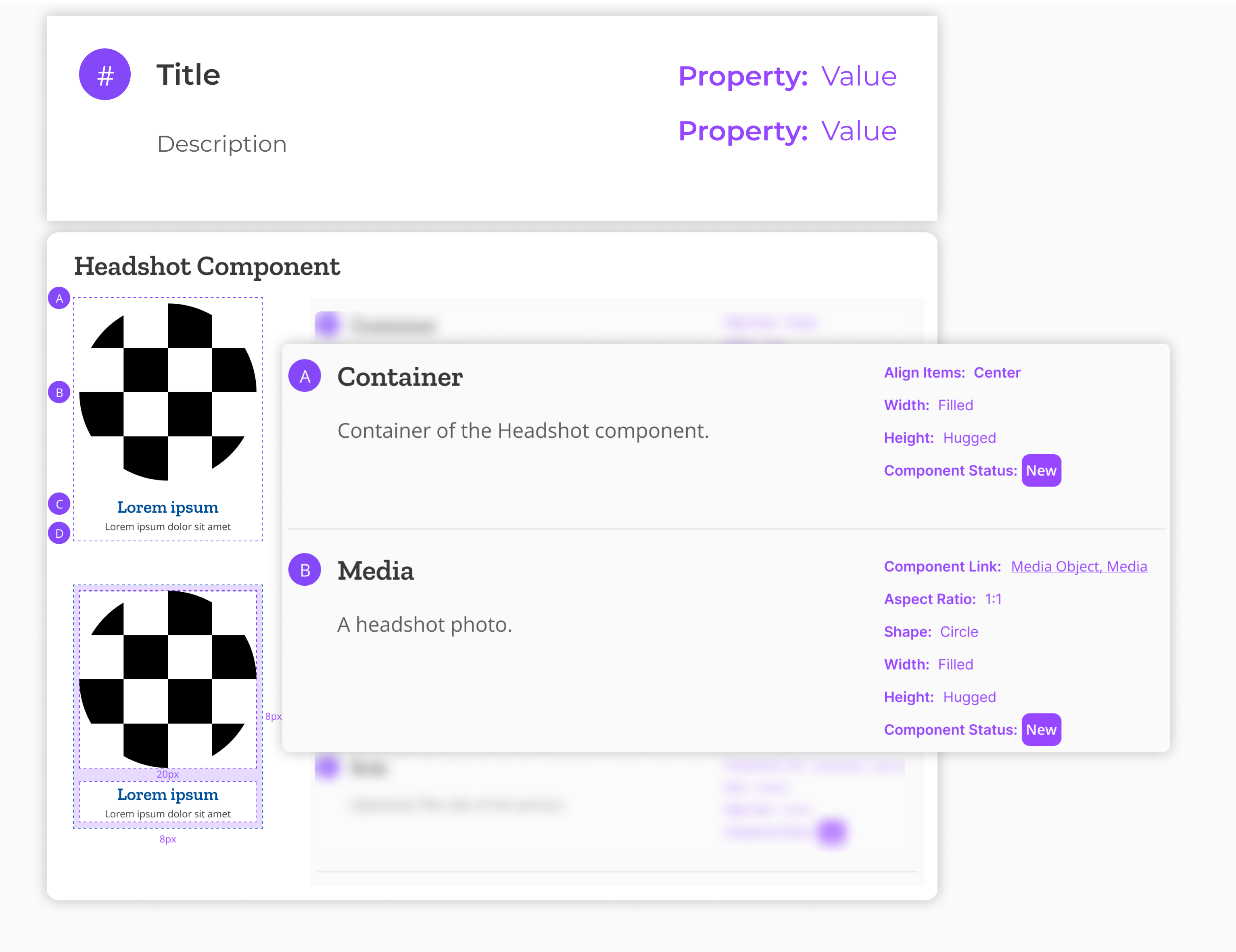
Customized annotations to help designers and developers communicate effectively.
•
Collaborated with other designers using the Atomic Design method.
OVERVIEW
Project Scope
My Role
•
Project owner
•
Main contributor
My Team
•
2 Designers
•
1 Developer
Duration & Deliverable
~2
Months
9+
Components & Annotations
90+
Components Variants
2
Prototypes
Tools
Figma
Browser
Inspect Too
Abstract
Monday
PROCESS
Insights
User Story
“As a designer, I want to create a component from scratch for a wireframe design project, So that I can ensure that the component meets the specific needs of the project.”
Pain Points
•
Time consuming
•
Inconsistent design
•
Not flexible when there’s a change
“As a developer, I want to click on the individual component on the wireframe to understand the design, So that I can implement the component correctly.”
Pain Points
•
Risk of misinterpretation
•
Information overload
Why Is It Important?
•
Increased consistency to make the product more user-friendly and easier to navigate.
•
Increased flexibility that can be customized to meet the specific needs of a product and ensure it is adaptable to change.
•
Reduced development time by providing developers with a set of pre-built components that they can reuse.
•
Improved collaboration by providing a common vocabulary ensure everyone is on the same page.
PROCESS
Design
Media Component
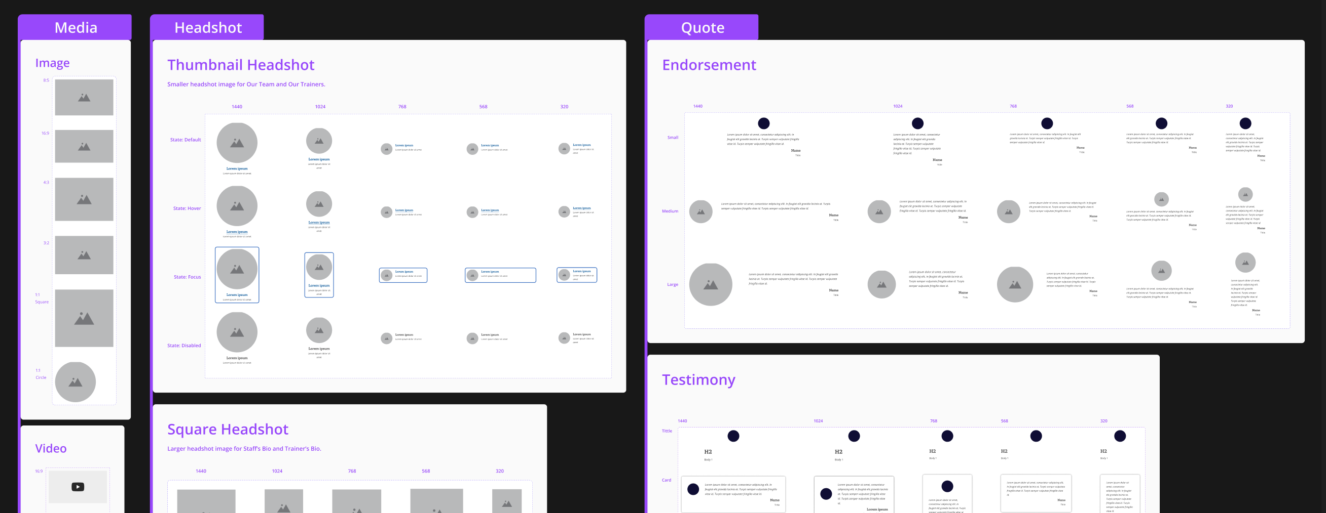
To be flexible but still maintain control, I allowed designers to swap components in the property panel. Built-in properties such as spacing helped to prevent inconsistencies.
Component Annotation
To help developers focus on the task at hand, I created component annotations that contain the property and description.
Collaboration
Using atomic design allowed me to collaborate with other designers who were working on different parts of the design system, such as typography and buttons.
Responsiveness
By making components responsive, I was able to ensure that all users could access the content and features of the product.
Component Library
I organized the components by their properties and use cases, making it easier for designers to find the desired component.
View Full Document >
Reference
Analyzing the current product's HTML and CSS with the Browser Inspect Tool helped me to categorize and name the components in the design system. It also allowed me to gain a deeper understanding of how the product is built and how the different components interact with each other.
PROCESS
Testing
What Worked
✅
The design system was functional and can be used to create high-quality wireframe with consistency.
✅
The components were flexible and can be updated if needed.
What Did Not Work
❌
The annotation used technical terms that developers may not be familiar with.
❌
The component was causing excessive scrolling and physical interaction on mobile devices.
Testing Plan
Objective:
The component was causing excessive scrolling and physical interaction on mobile devices.
Methods:
Using the new Media Component system in a page design project. The developers will implement it in our product. I observed and documented the process to understand the usability of the system.
PROCESS
Iteration
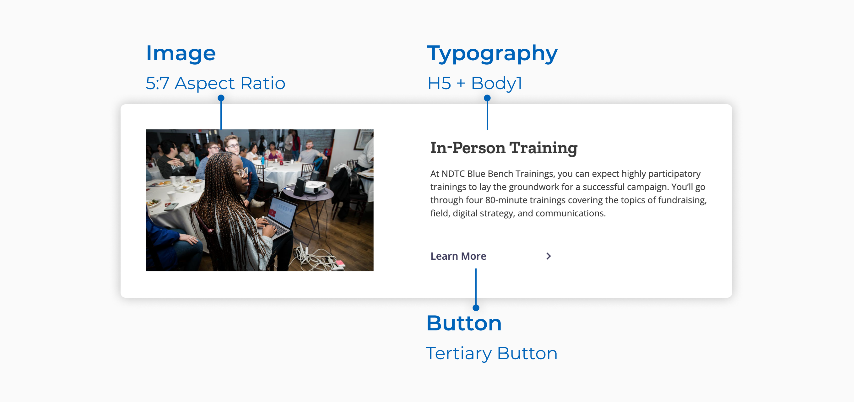
I adapted the component annotation to use common terminology so that developers could understand it.
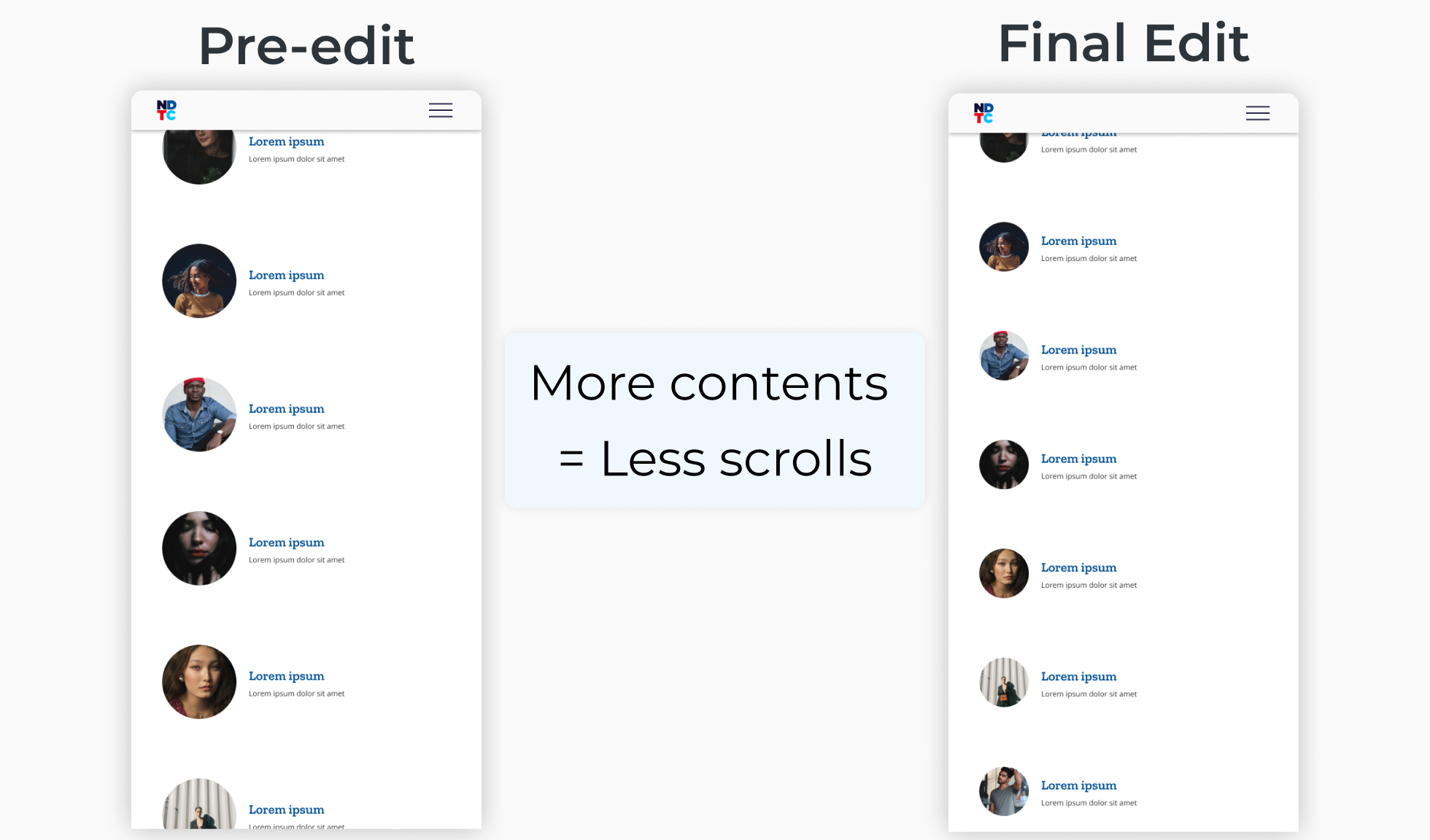
To improve the mobile experience, I decreased the component sizing on the continuous scroll page with plenty of content. This reduced the amount of scrolling required to find desired content.
AFTERMATH
Impact
The new Media Component System saved designers time and effort by providing them with a consistent set of components to use.
Designer’s feedback: While working on a page design project, I needed the XYZ component. Instead of creating it from scratch, I was able to find it in the Figma component library.
The new Media Component System also improved communication between designers and developers by standardizing technical terms used during the hand-off stage.
Developer’s feedback: Component annotations were really helpful when implementing a page. They allowed me to quickly and easily understand the purpose and behavior of each component, without having to check each one individually.
AFTERMATH
Lesson
Perfect Design System does not exist.
I found myself falling into the hole of making the system perfect. It's an ever evolving organism. A "perfect" design system is not adaptable to changes.
AFTERMATH
Future Opportunities
Use Headless Design System & Design Tokens to bridge the gap between design and engineering.
Using design tokens could keep the design consistent and simplify the development process. Design token is similar to the class concept in CSS. Figma Token plugin even has an auto-annotation feature.